Email marketing is such a powerful tool, and it can do even more for you with a few little tweaks. There’s a lot you can do to improve conversions from emails, but let’s take a look at the call to action (CTA) specifically.
Here are some top tips for boosting your conversion rate by making some simple changes to your CTAs.
Get the Basics Right
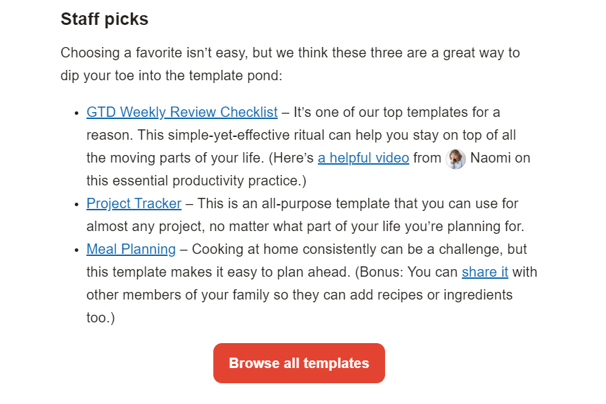
Email marketing CTAs can be fairly formulaic, but there’s a good reason for it. You want your CTA to be recognizable for what it is. If people don’t know you’re asking something of them, they’re far less likely to respond.
For your CTA, just stick to the basics:
- Put it as a button, not a link
- Keep the CTA relevant to the email content
- Make it clear where the link goes

These are the basics for email marketing CTAs. All the basics work for emails viewed on mobile and otherwise. There’s a lot more you can do to make them better, which we’ll go over more below, but you have to make sure you get the basics right every time. Even if you’re experimenting with a lot of different things in your emails, keep your CTA basics in line.
Less Is More
If you want your CTA to be more impactful, you need to have a singular focus. Keep your focus on the one big ask instead of diluting the email with many smaller asks.
Having a single CTA for each email makes it easier for people to understand what you’re asking from them and respond to it. There’s no opportunity for confusion over what they’re supposed to do, and you can use the entire email to give them a reason why they should respond to your CTA.
A unified focus on a singular CTA allows you to take your time crafting a cohesive email that consistently points the reader toward a specific action. With CTAs in emails, less is more!
Placement Matters
Although email CTAs are often at the very bottom of an email, they’re more effective when they’re higher up instead. The earlier your readers see the CTA, the more likely they are to interact with it.
According to a report from Litmus, people spend an average of around 9 seconds looking at marketing emails they open. That’s not a lot of time to make your case. If you’re counting on people reading through your whole email before clicking, you may miss out on a lot of people who don’t get through it all.
The best place for an email CTA is somewhere above the fold. This means it should appear in the upper half of the email, somewhere visible when the email is first opened or shortly after.
If you want to put in more than one CTA, you can put one above the fold and another at the bottom, or you can use the same CTA with multiple buttons throughout the email. Either way, make sure you have at least one prominent CTA high up in the email.
Make It Interactive
Interactive elements in an email aren’t always a good idea, but subtle animations that draw the eye toward a CTA can make a huge impact.
Think small. A little sparkle on a button, a color change, simple expansion animations, etc. Adding just a little movement to the CTA button can make it more eye-catching and easier to see, which in turn makes it easier to click.
Communicate Urgency
When there’s any time sensitivity or limitation to what you’re offering, make sure to communicate it clearly through your CTA. CTAs with a sense of urgency tend to drive more clicks than those without it.
If you’re hosting a webinar on a specific day and looking for sign-ups, put the deadline front and center. If you’ve got a special offer going on a course you’re selling, let your readers know they need to get it now while it lasts.

Urgency doesn’t always come from constraints. Another way to communicate urgency is to focus on the value the reader will get from what you’re offering. With so much value a button click away, why wait?
Check Your Copy
What actual words are you using in your CTA and button? CTA copy is important to getting more conversions since you have such a small amount of space to make a big ask.
Use action words relevant to what’s on offer. Be clear and concise with your words. Get straight to the point and make it obvious what a click will do.
Go for strong CTAs like these:
- Buy now
- Subscribe for updates
- Learn more
- Start my trial
- Get 50% now
- Sign up
- Reserve your spot
- Try it for free
Notice how these example CTAs all start with action words. They only include a handful of words, with every word pulling its weight.
Wordy or passive CTAs are not as compelling. Use your space wisely to make the biggest impact on your readers.
Use Color Thoughtfully
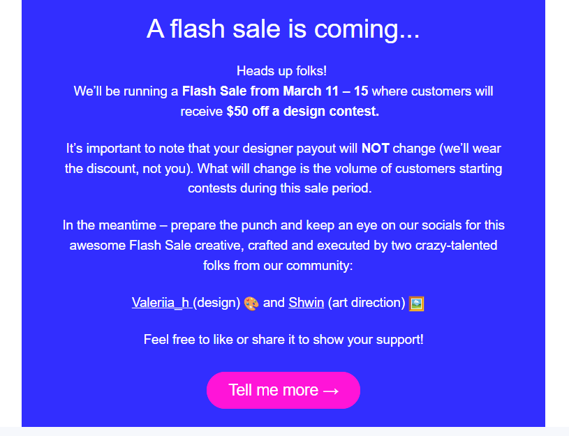
Color can be a powerful tool to draw people’s attention, as long as it’s used thoughtfully. Too much color or contrast is overwhelming. White space can break up your email content a lot and help your CTAs stand out.
Even if you’re not using white space per se, make sure there’s enough visual consistency so your colors aren’t overwhelming.

By using color smartly to highlight CTAs, your emails will be easier to read and your readers will be able to interact with the emails more effectively. Try to use consistent colors that are part of your branding so your emails are more predictable and aligned to your brand as closely as possible.
Speak to Your Audience
Make sure your CTA is written directly to your audience, whoever they are. It should be personal and inviting, speaking to what your audience values. Don’t write for a theoretical or general audience. Take the opportunity to make it as personal to your own audience as possible.
At the end of the day, it doesn’t matter if your CTA is appealing to everyone. You only need it to be appealing to the people who are reading your emails. Know your audience and cater your CTA copy to what works with them.
Use First-Person Tense
Speaking of your audience, something you can try is to write your CTAs with their response in mind. When people are reading your emails, it can be a powerful thing to write your copy in first-person, so their inner voice is responding positively.
CTAs like “activate my discount” or “Yes, I’m interested” can be more compelling than those written in third person (for example, “activate your discount”). Second and third-person voice is great for sales copy, but CTA buttons can be written in first-person voice to mimic the response you want from the person.

As simple as it sounds, you can drive more conversions with small language changes like having someone read “reserve my spot” instead of “reserve your spot”.
Ready to make your email marketing CTAs more impactful with a few simple tweaks? Try these tips for an easy way to boost your conversions without making any dramatic changes to your emails themselves.


